Table of Contents
ToggleYour home’s exterior paint color is one of the first things visitors notice, and one of the biggest factors in how you feel pulling into your driveway. Unlike interior paint, where you can repaint a wall in a weekend, exterior paint is a 5–10 year commitment depending on climate and sun exposure. Getting it right saves you from expensive do-overs and boosts curb appeal immediately. This guide walks you through choosing an exterior paint color that works with your home’s architecture, local climate, and neighborhood context, not just whatever trend is circulating Pinterest.
Key Takeaways
- House exterior paint colors are a 5–10 year commitment that dramatically impact curb appeal, making it essential to observe your home’s lighting patterns, roof color, and landscaping before deciding.
- Neutral palettes like soft whites, creams, warm grays, and taupe remain timeless and versatile, while deep tones such as forest green and navy add dramatic character when paired with quality architectural details.
- Test large paint samples (at least 3’×3′ sections) directly on your home’s siding at different times of day for 3–5 days, as undertones and light exposure significantly affect how colors appear.
- Climate and sun exposure directly influence color fading and appearance—UV-intensive regions require fade-resistant formulas and lighter shades, while humid climates need mildew-resistant options.
- Trim color strategy and neighborhood context matter: white or cream trim provides clean contrast, dark trim creates definition, and your color choice should complement rather than drastically clash with surrounding homes.
- Invest in quality exterior paint ($50–$80 per gallon) and budget $1,500–$5,000+ for professional application, and always verify HOA restrictions before committing to your house exterior paint color choice.
Understanding How Exterior Colors Impact Your Home’s Curb Appeal
Color doesn’t exist in isolation on your house. It interacts with roof material, trim, landscaping, and surrounding homes. A color that looks sharp on a paint chip under fluorescent store lighting can look muddy or washed out in full sun, or too dark at dusk.
Start by considering how light hits your home at different times. North-facing walls stay cooler and can handle deeper, moodier tones. South and west-facing walls get intense afternoon and evening sun, which can fade or intensify colors over time. East-facing walls see soft morning light, which typically flatters softer hues. Spend time observing your home’s lighting patterns, morning, midday, and late afternoon.
Your roof color matters enormously. Dark roofs pair well with lighter, neutral walls (cream, soft gray, taupe). Light or brown roofs give you more flexibility but work best with complementary mid-tones or natural earth shades. Don’t ignore landscaping either: evergreens, deciduous trees, and garden beds all influence how a color reads on your home. If you’re thinking about planting new shrubs or updating beds, hold off on finalizing paint until you’ve visualized the full picture.
Neighborhood context also plays a subtle but real role. You’re not trying to match every house on the block, but standing out too drastically can actually reduce curb appeal. Drive through your area at different times and notice what works, not to copy, but to understand the local aesthetic baseline.
Classic Exterior Paint Colors That Never Go Out Of Style
Neutral Palettes: Timeless Beiges, Grays, And Whites
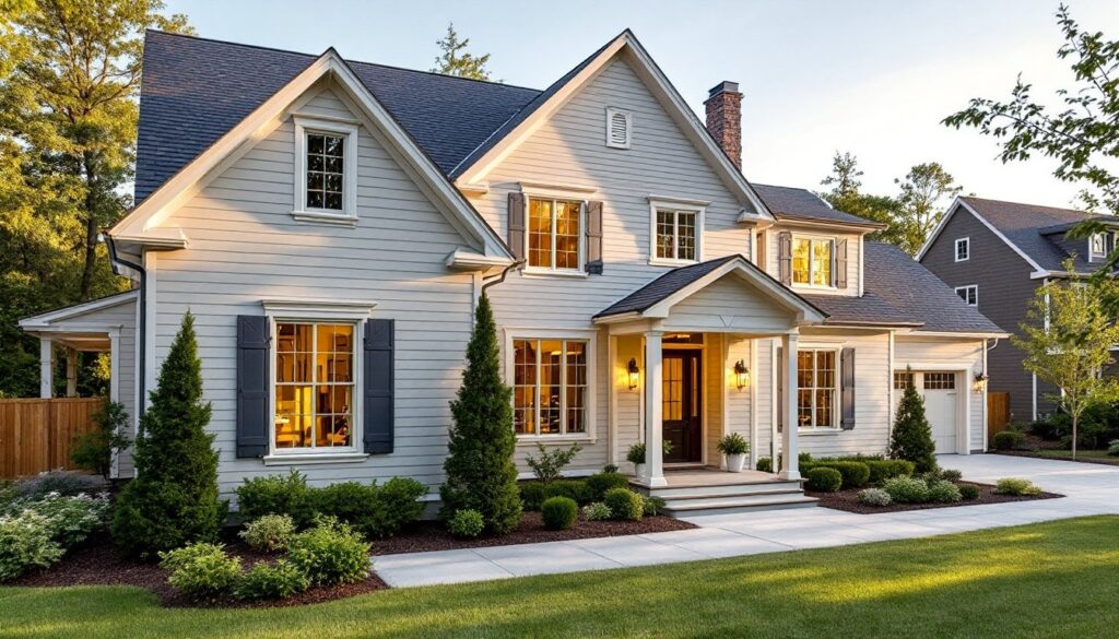
Neutrals dominate high-end homes and commercial properties for a reason: they’re versatile, they age well, and they pair with nearly any trim, roof, or landscaping. Soft whites and creams (like Benjamin Moore’s Chantilly Lace or Sherwin-Williams’ Alabaster) remain the safest bet. They brighten the home, work with virtually any architectural style, and don’t feel dated. True whites can feel sterile: creamy whites add warmth without looking yellow.
Warm grays and taupe are increasingly popular because they offer sophistication without the harshness of pure gray. These typically have undertones of brown, beige, or even slight green. The trick is test multiple samples, gray can look purple, blue, or greenish depending on regional light and your home’s orientation. Order large paint samples (many retailers sell 8″×10″ boards) and tape them to your house. Observe them throughout the day and in different weather.
True charcoal and dark grays work beautifully on modern homes with clean lines or farmhouse-style properties, especially when paired with white or cream trim. They’re bold without being trendy. Just ensure your neighborhood supports it and that you’re not opting for dark purely for fashion, dark colors fade faster in intense sun and may read as gloomy in overcast climates.
Deep, Rich Tones For Dramatic Curb Appeal
Deep greens, navy, and forest tones have made a strong comeback, especially for cottage, farmhouse, and traditional homes. Forest green pairs gorgeously with natural wood trim or black metal accents. Navy reads almost black in low light but shows rich color in daylight. These shades work best on homes with good architectural detail, siding texture, trim work, or stonework to break up the visual mass. On a blank rectangle of vinyl siding, dark colors can look heavy.
Historical homes often wore warm, muted earth tones, soft reds, rust, terracotta, and ochre. If your home has period architecture or you live in a region with historical roots, research period-appropriate colors. Regional variations matter: New England colonials, Southern plantation homes, and Southwestern adobe each had distinct palettes. Ben and Erin Napier’s approach to exterior paint demonstrates how thoughtful color selection enhances architectural character.
When choosing deep tones, invest in premium exterior paint. Budget-grade paint doesn’t hold deep colors as richly and fades faster. You’ll also need more coats, typically two plus primer. Budget accordingly, as a second coat of dark paint is non-negotiable for even coverage.
Modern Exterior Paint Trends For Contemporary Homes
Contemporary home design leans toward bold single colors, asymmetrical trim combinations, and colors that blur the line between indoors and out. Matte black and dark charcoal remain the default for modern new construction, especially paired with natural wood, metal siding, or stone. These create sharp visual contrast and photograph beautifully.
Soft, earthy tones with gray undertones, think dusty sage, warm greige, or muted olive, are trending for homeowners wanting sophistication without stark contrast. These work particularly well if you plan to combine siding materials (wood and metal, for example). They feel current without being obviously trendy, which means they’ll age better than neon accents or heavily saturated colors.
Warm whites with undertones (cream, ivory, or barely-there yellow) are edging out cool whites on modern homes. This shift reflects changing perspectives on natural light and comfort. Pair these with contrasting dark trim, metal hardware, or architectural details to prevent the home from feeling too soft or washed out.
Home Bunch features countless contemporary color combinations where you can see how modern homes use color boldly but deliberately. If you’re drawn to trendy colors, test them first with large samples and imagine living with that color for 5–10 years. Trends shift fast: your commitment to paint doesn’t.
Factors To Consider Before Selecting Your Exterior Paint Color
Climate and sun exposure directly affect how paint performs and how color appears. UV rays in sunny climates (Southwest, Southern states) fade colors faster. Choose proven fade-resistant formulas, and lean toward lighter shades if sun exposure is intense. Humid climates (Southeast, Pacific Northwest) favor mildew-resistant formulas and colors that hide algae growth better (avoid very light grays on north-facing walls in humid regions).
Material and texture of your siding influence color appearance. Textured vinyl, wood siding, and fiber cement all refract light differently. Rough surfaces scatter light and often make colors read slightly darker than smooth finishes. View your samples on actual siding material, not just painted paper.
Undertones matter more than you think. A gray might have blue, purple, brown, or even green undertones. The undertone affects how the color feels, blue-gray feels cool and modern, brown-gray feels warm and traditional. Ask at the paint counter about undertones, and test at least two or three similar colors.
Trim color strategy shapes the overall look. White or cream trim offers clean contrast and brightens the home. Dark trim (charcoal, black, deep brown) creates defined architectural lines. Matching trim to siding minimizes visual breaks and suits minimalist modern homes. Complementary trim (opposite but harmonious to the main color) works for traditional and farmhouse styles.
Budget realistically. Quality exterior paint runs $50–$80 per gallon. A two-story home typically needs 10–15 gallons for primer plus two finish coats. Don’t skimp on paint quality for exterior work, you’re paying for UV resistance, durability, and color retention. Labor costs vary by region ($1,500–$5,000+ for professional application), so get multiple quotes if hiring.
Permits and HOA requirements exist in some jurisdictions and neighborhoods. Check local building codes for structural work like siding replacement, and verify your HOA’s color restrictions before committing. Some neighborhoods have approved color palettes. A conversation with the HOA saves frustration after expensive paint is already on the wall.
Test before you commit. Buy sample pints and paint large swatches (at least 3’×3′ sections) on different exposures of your home. Live with them for 3–5 days, observing morning, afternoon, and evening light. The best paint color isn’t the one that looks perfect on the chip, it’s the one that makes you happy when you come home.
Conclusion
Choosing an exterior paint color is a blend of practical considerations (light, material, climate, budget) and personal preference. There’s no universally “right” answer, but there are smarter decisions made after observation and testing. Take your time, test samples in real conditions, and trust your instinct. Southern Living’s approach to regional home design offers additional inspiration rooted in practical, regional wisdom. A thoughtful color choice pays dividends in curb appeal and satisfaction for years to come.